


Method for visualizing cybersecurity incidents
Data Visualization / US Patent
The cybersecurity industry feels the pressures of skilled staff shortages and job fatigue, leaving security analysts unable to manage the enormous volume of cybersecurity incidents in their organization. Businesses become vulnerable to unaddressed security threats and potential data breaches. In this project, I sought to create a data visualization that would give analysts a bird’s eye view of what happened in their network with progressive disclosure to the data they need, at the time they needed it.
Contributors: Andi Lozano, Terra Banal, Jimmy Loughran, Liz Rogers
The problem
In 2018, QRadar Advisor sought the help of design to understand their users’ needs primarily through the use of a knowledge graph that visualized cybersecurity incidents.

Original Advisor knowledge graph
CISOs and security leaders found the original knowledge graph to be “impressive” because it matched their mental model of how the internet looked and behaved. However, end-users (security analysts), characterized the existing knowledge graph as "this big spider web" that "displayed too much data in a format that wasn't clear." For them, the knowledge graph is an intimidating artifact that is difficult to interpret.
Knowledge graphs can be helpful because they provide visual relationships and correlated data. But what happens when you have hundreds of IP addresses all reaching out to multiple external connections? How can an inexperienced analyst stop cyber threats with a graph that isn’t consumable?
Understand
At the start of this project, we were a small design team of two. Cybersecurity is a complex domain— throw in a dash of threat intelligence here and a sprinkle of artificial intelligence there, and that’s a lot for two new designers to crack. We set out to fully understand the problem, and how we, as product team (design, development, and offering management) could provide value to our end users.

Since our team was co-located, we used Mural to vote on our project’s mission using metaphors. We use metaphors to explain the new and unfamiliar into relatable terms. Our project’s solution would be like one of the following metaphors:
a home alarm system taking every necessary step to stop intruders
a personal yoga instructor helping you improve your security posture
a wearable MRI machine detecting the beginning stages of a disease before it becomes life-threatening
a Roomba for your environment, keeping rules tidy and reducing false positives
a complete puzzle showing you the full picture of an attack
We chose the puzzle metaphor, and ultimately landed on this mission:

This mission resonated so much with me personally, as I can still recite this today without having to look at an old slide deck. Passionate designers create truly meaningful experiences when the mission rings close to their hearts.
Puzzles have many pieces, some of which fit together, others that don't, and still others that might be missing. Our mission was to present analysts with all of the pieces of the puzzle that were available (e.g., the source of the attack, user and asset information, threat intelligence, malicious observables) and let analysts put together the full picture.
Design concepts
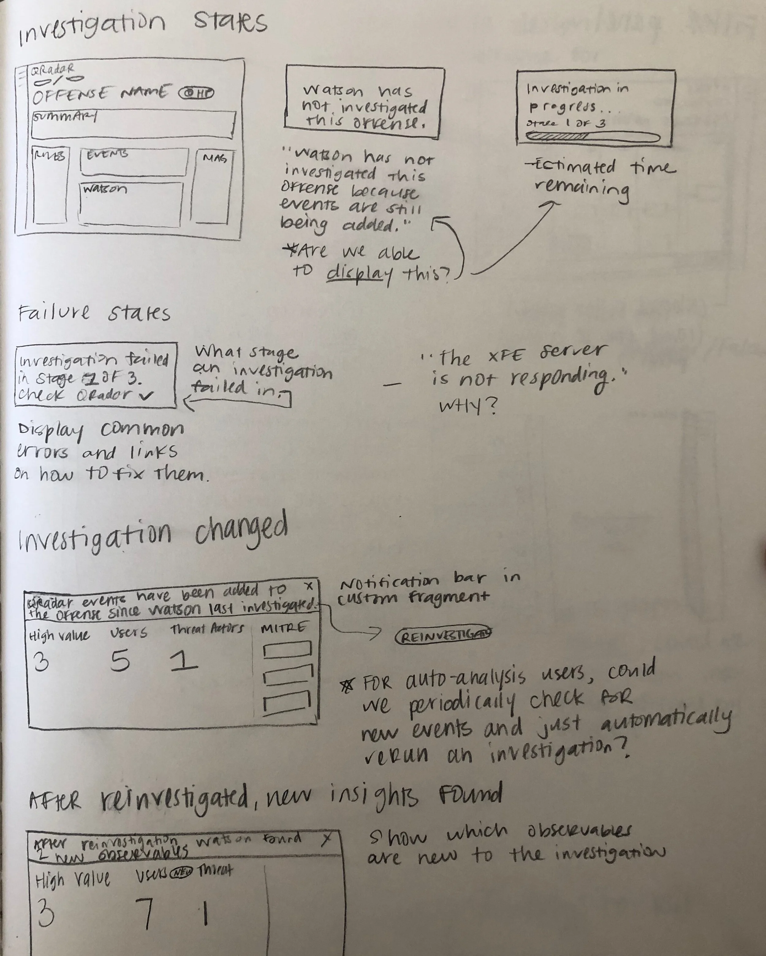
When in doubt, draw it out. Quick concepts and paper prototypes help me iterate quickly without having to worry about pixel perfect designs.


User research

Through two rounds of research led by our lead UX researcher, we presented multiple concepts that would help a security analyst see the whole picture of an attack and quickly collect evidence to build a case for the security incident.
Users found a few things that made our design concepts more useful than the original knowledge graph:
The left to right linear orientation beginning with the source of in the incident
Structured swim lanes with similar data points clustered together
Progressive disclosure to the data they needed, when they needed it


“If you could get a graphical representation that shows you what you’re looking for and at least points you in the right direction, it’s worth a million bucks — compared to going through ten thousand rows, trying to find it yourself later, adding filters on filters on filters, trying to figure out what caused it or what happened and trying to make sense of the data.”
The new knowledge graph sought to structure the data in a way that would give the analyst the flow of the security incident, all the way to the malware or threats that were found in their network.
Rapid collaboration
After we completed the research, we worked closely with development to create a graph that was technically feasible.
We worked with a front-end developer who helped us identify holes in the design. Some things go uncovered through static images in Sketch, so we were able to rapidly collaborate on a POC and quickly iterate through design concepts and graphical behaviors.

Use case applications
Because the graph was versatile in nature, we were able to apply it to multiple use cases with three principles:
Correlated data
The swim lane graph draws correlated relationships in network data that you, as the user, didn’t know existed
Progressive disclosure
The swim lane graph tells the story of what happened in a network with progressive disclosure to the data and content you need
Enrichment
The swim lane graph provides enriched content in-context on threat intelligence or data sources
“I want to thank Terra Banal and Andi Lozano, the two designers on the Advisor team. Both are amazing designers and people. Without them, there would be no new knowledge graph visualization, nor would the research have been as successful as it was. ”
QRadar Advisor seeks to build this graph in 2020 and, therefore, final designs cannot be shared at this time.
A patent application for P201910089US01 has been filed with the US Patent Office on May 5, 2020 /