


Consumability — Regular Use
Core UX at IBM Security
When users interact with a product our offering, it’s more than a human-to-computer exchange— it’s a conversation. When a user clicks on a button or completes an action, the user expects to have confirmation that the system knows they are there. It’s through these conversations that our users began to develop a relationship with our offerings.
Contributors: Andi Lozano, Peter Vachon
Process

Context
The Consumability Program is a division-wide initiative at IBM Security to ensure best-in-class product experience. This program benchmarks product use cases against a set of standards created by business unit leaders to ensure that IBM Security products are up to par. Each experience offers opportunities to solve unmet needs and emotionally bond users to products. For IBM Security, these experiences are:
Discover
Try
Buy
Get started
Regular Use
Get help
Upgrade
Integrate
End use
The problem
While the content was thoughtfully written for the Consumability program, the standards and guidance were just in a long-form text format listing benchmarks that needed to be met. IBM Security’s executive leadership noticed that product teams were having trouble consuming the content on the page— it was simply too abstract for non-design folks to understand the nuances in the standards and intent of the interaction.
Understand the as-is

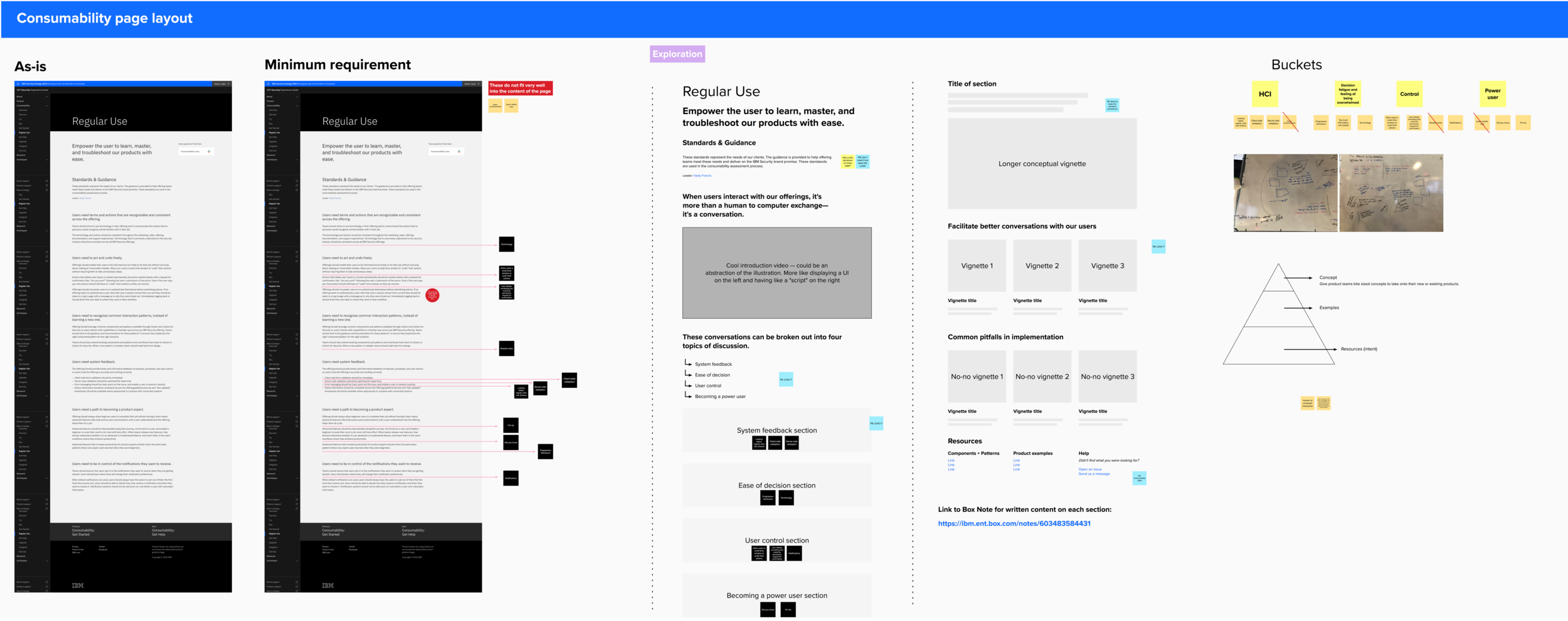
Viewing the list of standards and guidance as a north star, we brainstormed how we could visually represent these best-in-class UX patterns through the use of prototype vignettes, which are 6-8 videos abstracted from specific products or offerings. The fidelity of these vignettes helped to reduce the noise of a typical design mockup and allowed us to hone in on the nuances of the UX pattern itself.
A tight timeline
Now, a cupcake experience of the work would be to just simply place the prototype vignettes directly in the long form copy. But if given a bit more time, we could remix the words on the page and get to the heart of the message. What does Regular Use for a product really mean?
We showed quick mockups that I made in Mural:
Concept 1: Detailed the As-is
Concept 2: Minimum requirement for the fastest delivery — doesn’t quite solve the problem
Concept 3: Completely remix and break down the content and organize it into bite-sized, consumable sections
Tell a better story

After we got stakeholder buy-in for a little more time, we began visual explorations of how product teams might answer these questions:
What is the standard for Regular Use?
What does it look like?
What should it not look like?
What resources already exist so I don’t have to build this from scratch?
Have other products done this successfully?
We did this by breaking out the content into four sections:
Ease of decision
System feedback
Sense of control
Becoming a power user
Each of these sections showed best practices and pitfalls in implementation, links to our open source component library (Carbon for IBM Security) so product teams could build the standard themselves, product examples, and how product teams could get help or design support.
Prototyping in the browser
There comes a time in any design process where sometimes it’s just better to prototype in a live environment. I got set up with a Gatsby.js and node.js environment to build the new Regular Use page straight in the browser so I could rapidly find holes in our design. Let me be clear: the last time I even opened a code editor was in college and I truly had no idea what I was doing. If it wasn’t for a mandated work-from-order in the middle of a pandemic and having a software engineer as a husband, I might be bald right now from stress. Instead, I screamed questions from the living room like “WHAT’S THE GIT COMMAND FOR [insert literally anything here]”.
Some say anything is possible if you just believe, but I say anything is possible if you’re willing to pull your eyelashes out one-by-one before you push your very first commit. I built the whole page myself and merged it into our production branch.

Finalizing the vignettes
While both Peter and I worked to finalize the vignettes and triple-check content, I’d simply drop them into my local branch and make sure we weren’t missing anything.


Key takeaways
Show, don’t tell
Get buy-in on something you think is a better experience by showing how the original request would actually look.
Get cozy in the discomfort
Learning a new skill and trying to pick up coding chops in the middle of a project can be scary, but in doing so you can cut out bottlenecks and level yourself up as a designer.
Abstract the experience
Let your work be measurable by showing how it can scale to other products and offerings.
Looking forward
Before we felt like this work could be wrapped up, we wanted to provide a way for other leaders in the Consumability program to think about how they could remix their content through a remote workshop in Mural. This enabled non-design folks to think about their content in a user-centered way, without having to use a design tool like Sketch or Figma.
